Time magazine makes Church & State finally collapse!
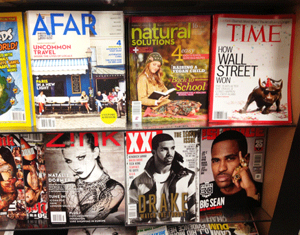
Here’s a great cover of Time, fresh out this week. I don’t know if the bull really does have such a drunken smile, whether it’s a model or all done in post. But either way it’s bright, fast and funny.
I like the white ground too, it makes the red border pop, much like their infamous breastfeeding cover we all wrote about not so long ago.
 Time’s not exactly a newsstand powerhouse, but it still looks good in the rack.
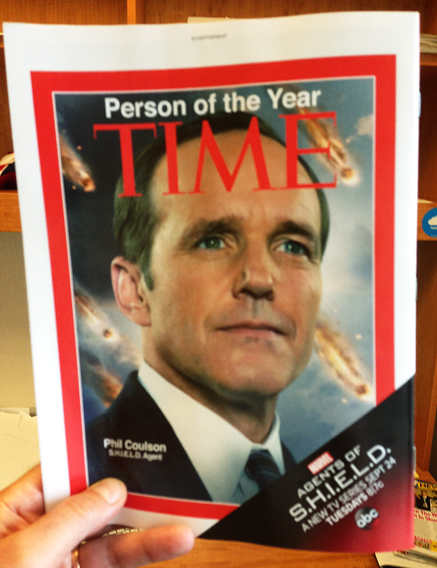
 But check this out, the BACK cover! Given how queasy Americans can be about issues of Church and State, I was surprised to see this, but I think it works really well.
It’s a great ad, but there’s no way any reader could mistake it for editorial, because it’s the bleeding of the red border that makes a Time cover just that. Here, the white frame around the red makes clear that this is not the Real Thing.
But bleed is an effect only found in print. It’s a powerful gesture, as it suggests the colour (or the image) goes on forever, that it’s merely the limitation of the production process that has determined where the edge is. This is one of the reasons that reportage images work much better when bled.
But what happens in digital? There’s no limit to the canvas there, so there’s no physical indication to the edge of the picture. Which suggests that online, that S.H.I.E.L.D. ad is going to look an awful lot more authentic.


