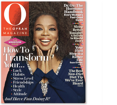
How to make a monthly cover look both premium and popular at the same time
 I confess, I love O Magazine. It’s empowering, entertaining, and delivered with real integrity. As the print brand extension of Oprah herself, it’s not like other magazines. She’s always on the cover; everything the magazine does is an aspect of her worldview. The whole thing stands or falls on how we feel about her, but given that she is one of the most compelling media figures of our age, she commands a pretty big audience.
But the new cover is notable, hence this post. Firstly, this is the first time Oprah has ever appeared on her cover without blow-drying or straightening her hair. Given that this splash is all about transformation, it’s a powerful illustration of what changing your hair can do, both of how others see you, and more importantly how you see yourself. Given the politics surrounding black women’s hair, this is a big move by Oprah.
But after that, the thing I admire here is the coverlines. Transformation is a staple of women’s magazines; it’s something the format can illustrate better than any other medium, save perhaps television. And here, the promise is really big and bold.
It’s not just the usual stuff about changing your looks or your wardrobe. Here, the story is all about the way you really live your life. It doesn’t feel superficial, it suggests something a little deeper. The other lines are pretty good too. Doctor Oz has already been noted on this blog as America’s hottest cover star; here he presents his handy hormone handbook. In addition we’ve got good stuff on sleep, a believable non-diet diet story, and the brilliant Suzie Orman.
The design of O Magazine has always been a masterclass in how to make a mass-market title look high-end. Originally created by Carla Frank, the secret to its success has been the way the colour is managed. It’s easy to make a title look posh by stripping it back to black. But that’s way too cool and unapproachable for a big selling title like this. Equally, chucking the paint box at it would drag it down way below any advertiser’s level of interest.
On this cover, there are at least six colours, but they’ve been handled so precisely, it feels lively and fun without risking the sophisticated aesthetic. The type is good too, the serif signifies upscale content, but the weight makes it friendly and approachable.
I haven’t seen the issue yet, but I’ll be keen to see how these promises play out inside. In the meantime, I recommend taking a look at some of Carla’s work on O Magazine back in the day. There’s loads of it on her site, it’s possibly some of the greatest magazine design work you’ll ever see.

