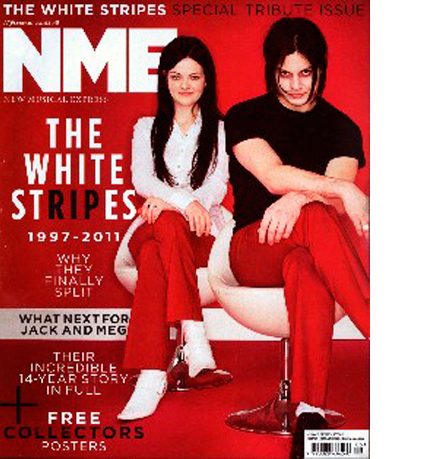
Red. Black. White.
 This post was first made at npdnotebook in February 2011
So the White Stripes have split up. Which gives the NME to choose the defining image of their career.
And this is a great picture. There is an extraordinary amount to look at and enjoy. The dark shadows under his eyes, her knowing smile, the position of the chairs emphasising his size, whilst all the while maintaining their shared body language.
I could go on and on, but I don’t need to because the cover is RED. Red is the NME’s brand colour, so all the love towards the White Stripes is able to infuse the brand, likewise the brand has a clear opportunity to claim ownership over the content.
The challenge with this cover is the tension between timeless and timeliness. The lines themselves are full of urgency, but here their presentation is more akin to what Vanity Fair might do one month later.
The NME is a weekly, just the same as Chat. Both must create a genuine sense of event, this week the NME have been handed one on a plate, and so they’ve got away with a cool aesthetic. The challenge will be next week, when they’ve got an unheard of indie band on the cover.
All said, given that no-one has actually died, the black border and RIP detail are moments of quiet genius.

