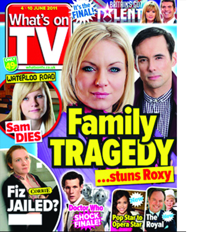
How to shift a million copies on the newsstand. Every week!
 This post was first published at npdnotebook in June 2011
What’s on TV is not at the glamour end of the business, but it consistently sells over a million copies a week thanks to genius pieces of work like this. As a brand it completely defines the budget TV listings market. Often copied, but never bettered: it invented the conventions, adheres to them and constantly enhances them to maximum effect.
The content pops from a blue back plate. And here, the glow adds an additional level of movement and feeling. The yellow splash is present and correct, but the black outline has been turned all the way up to eleven. You could see this coverline from space! It’s important to visualise the price clearly, which is why green is such a shrewd move. It stands out from all the other colours, yet never gets in front of the content. Dark blue and magenta add accents, but overall, Art Director Dave Richardson’s colour palette is pretty restrained to let the splash stand out.
Editor Colin Tough’s lines are really good too. Absolute brevity and focus on what’s important, which in this market is ‘Family’, closely followed by ‘Tragedy’.

