What makes you pick up a cover, even when the magazine is free?
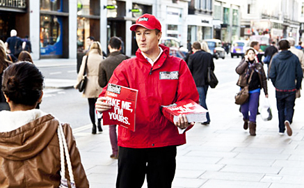 A couple of weeks ago, Time Out went free. Here’s one of their distributors handing out the first issue of their Brave New Business Plan. Knowing this, and as a spoiler of sorts, the Big Issue responded with a very clever cover proclaiming that it’s ‘Worth paying for’.
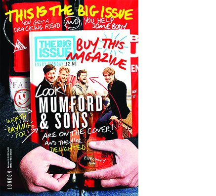 Which it undoubtably is, given that the money goes directly to a homeless vendor. But it’s also true to say that this unique business model means that the customer is not just paying for the content. The value and reward is all wrapped up in the transaction itself, which this particular cover explicilty visualises.
What’s more, the halo effect of this transaction spills over into the appreciation of the content, making you feel good about what you’re reading. That said, for most of their readers I suspect the content is a secondary reason for purchase. This makes the Big Issue content essentially free.
But the fact remains that both audience and brand have a strong social conscience. And along with their vendors, all believe their actions can improve matters. This gives the Big Issue a unique opportunity to put stories that matter in front of people who otherwise would never read them. Thier website proclaims that here is ‘Journalism worth paying for’ Like supporting the homeless, the challenge for all of us is to make sure that both these ideas don’t just fade away.
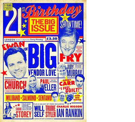 And a great cover is the very best way of keeping their brand on the boil. It makes the purchase experience exciting, it dignifies the homeless vendors’ investment in their stock, and it allows the reader to explain to the world who they are in that particular moment. And as if to prove that very point, here is their latest. The execution is stunning, matching anything Bloomberg and the like may be able to produce.
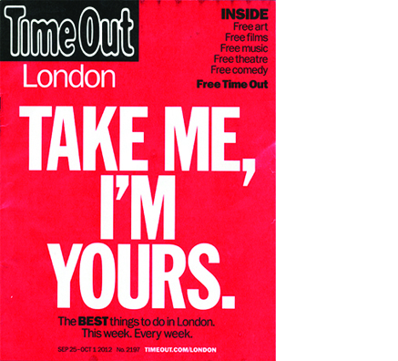 Time Out now have an entirely new agenda, as this, their first free cover shows. It’s direct and to the point, a clear demonstration of the brand’s ubiquity and utility. Weirdly, as a subscriber, I don’t miss the loss of pages that much. It still tells me what’s on, and whether its any good or not. And it gives me ideas about things to do that I’m not explicitly searching for. But it doesn’t do much more, which means it’s dangerously reliant on the usability and portability of print as the reason for the magazine’s existence.
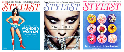 As Shortlist Media has shown with Stylist magazine, quality covers are still essential in the freemium marketplace. Without the commitment generated by paying for it, the cover needs to create a sense of intensity in the relationship with the reader. There is permission to take risks, be controversial, and best of all, not worry about proving there is enough inside to make it worth the cover price. Less obvious, but increasingly important, a good cover helps deflect any discomfort over being sold to by the advertisers in the issue, and increasingly, in front of the cover itself.
 Which brings us to this, the second issue of the all new, free Time Out. This made for lively debate in the office; Who is their audience now? What are they actually trying to do?
Peter Preston has a good piece in the Guardian about the lack of detail in the listings, its relationship with the competition, and the general proliferation of free magazines. But what does that mean for the cover?
With a paid proposition, a brand can be very clear with advertisers who’s buying it and why. Time Out’s paid audience was passionate, committed, and pretty knowledgable about film, food and all sorts. But recent covers have never really reflected that, with a reliance on the newsstand orientated play of LOTS and LOTS of lists. But now, do they attempt to sell the benefits of being associated with the refined tastes of their traditional readers, or do they become shamelessly populist in order to match expectations of a much larger and diffused audience?
This Helena Bonham Carter cover has divided the critics. For some, it’s neither one thing or the other. She’s not recognisable, she’s not famous enough, and the core idea is not visible enough. The headline doesn’t say much and the whole thing is very dark. Yet for a longtime lapsed reader who just strolled through my office, it was a huge success. He had re-sampled the brand, (as it was now free), found the cover compelling and intriguing, read the interview and proclaimed to me that he LOVED Time Out, despite not having bought an issue in the previous ten years.
Then he put it in the bin.


Great piece as ever, Andy. Quite right to highlight the creativity of Shortlist, Stylist and The Big Issue, all of which have to work with very tight budgets but regularly manage to turn this to their advantage and publish clever AND commerical covers.
Meanwhile that TO cover is so run of the mill Time Out you have to wonder what their thinking is. You have to INCREASE your appeal for free to work, for it to appear a valuable free good. These first two covers just look free, with all the dull, cheapness that implies.
Excellent article, Andy. Time Out has been getting worse and worse. In the past few months the listings have become shorter and shorter. e.g.: for Fringe, Time Out says just ‘Best Of Fringe’…listing maybe 3 or 4 shows each week. When in fact there are DOZENS of wonderful fringe shows on in London each week. Since it went free it has reduced it’s listings much further. And yes, the Helena Bonham Carter cover is RUBBISH.
Thanks Sue! Given that you’re Time Out’s heartland reader, if they’re losing you and your advocacy, then they’ve got real trouble ahead.
As usual Andy a fascinating post. The latest Big Issue cover is also very good, have they got a new editor there? We have discussed in the past at length, all over the world wide web, that you can only create great ‘stop & think’ covers with a visionary, supportive editor and a publisher with deep pockets. We shall have to see if they continue… As The Big Issue has to actually sell to the reader (albeit with a slightly different ‘customer relationship’ than the average paid for consumer magazine), it will only need a few vendors to question the strategy. I hope not. I too also love the creativity of Stylist, less so Shortlist, but these ‘free-mium’ (His word not mine!) magazines were created by Mr Soutar who has a strong consumer magazine background and who realised that if you make something look as smart as the product you usually buy you’ll only be too happy to get it for nothing. Though the fabulous training video he shot is always worth another view. http://youtu.be/hZXrc3QqNmk
Which brings us to why the free version of Time Out is such an unmitigated failure from an editorial point of view. Why are any of us surprised? I used to joke in magazine presentations years ago that Time Out was the one magazine that I and almost any other editorial designer I could mention, would redesign for free. As what ever pigs-ear that you made of it, it could only be an improvement on what was being published week in, week out. Those of us old enough to remember David King’s terrific original design for City Limits, realised long ago that listings don’t have to be dull. The ‘cracking’ idea that Time Out have had (“Let’s lose the listings from the mag and drive traffic to our website where we can charge ‘loadsamomey’ for the advertising and if we add to that the ad revenue for the DTF (Dead Tree Format) then ‘Kerching!”) is fundamentally flawed. No one seems to make websites, that aren’t retail sites, pay, ask uncle Rupert. The new Time Out is probably fine for the 20 somethings that don’t buy magazines anymore and survive their tube journeys on a diet of The Metro (visually stultifying), the Standard, Shortlist & Stylist, both as we discussed, visually interesting but hardly Pulitzer prize winning journalism. The Time Out relaunch is an opportunity missed, and a product of lazy thinking from a company that lost it’s ‘Mojo’ years ago. Which I guess is a longwinded way of saying you’re absolutely right Andy, maybe you should take it on and sort them out… for free of course!
Ha ha!
Welcome to our New Business Model. No fee, just…glory. Thanks for the post and insight, and particularly for finding the clip of Mike Soutar demonstrating how to greet the world. ‘Good Morning!’, is I think the catch phrase…