Category Archives: Masthead logos

How do you compete with a billion dollar logo?

buzzfeed-voxThis post was first published on The Media Briefing earlier this week.

Buzzfeed is now considered one of the world’s most innovative news organisation. It’s value is currently over $1b, getting close to the likes of The New York Times ($1.28b), and dwarfing other digital news sites. So it’s no surprise that more start-ups are wanting a slice of the pie.

American news site Vox is early out of the blocks, launched just three months after founder Ezra Klein left the Washington Post. He claims that Vox will ‘Explain the world’ but the site is already creating a stir, as evidenced by last weeks rant from a senior Facebook executive complaining that ‘Someone should fix this shit’

He was referring to Vox’s story about how you should ‘Wash your jeans instead of freezing them’, with the complaint was that they were not delivering  ‘A new home for serious journalism in a format that felt Internet-native’.

When it comes to content, you have to make your intentions very clear. Which is why design is central to a users understanding of what to expect. Can Vox persuade readers that it’s a real heavyweight political commentator? Can Buzzfeed change horses midstream and let us believe that they too should be taken seriously?

In short, what does the design of these two sites say about trust?

The logo fonts are fundamentally different. Buzzfeed’s is a functional sans, with an almost child-like feel created by the big lowercase ‘ee’. By contrast, Vox’s serif ‘V’ on their twitter icon is huge, and when spelt out has a sophisticated flourish. It feels high end, a bit like The Atlantic, redesigned by Pentagram not so long ago.
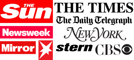
Newspaper-logosLikewise the colour means very different things. Not for nothing are serious newspaper logos black, and tabloids white out of red blocks. This visual language is impossible to deny: red means urgency, black is just inert. It has no opinion. (Although Stern have managed to have their cake and eat). But what does yellow mean in this equation?

Buzzfeed has built both traffic and reputation on spectacular viral techniques, listicles, cat videos, engaging headlines and their killer franchise, the online quiz, proving that content most people are interested in are stories about themselves.

But now they now want to do serious journalism. Reuters reports that they have boots on the ground in Ukraine, are publishing in-depth articles on Chinese dissenters and have had some big, breakout stories. But can Buzzfeed ever be regarded as a serious news site, when their key visual signature looks like this…
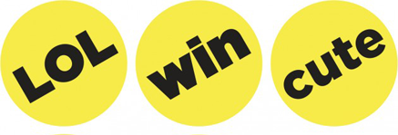
Buzzfeed-Logo-lolOr more precisely, LOL, in black type within a yellow circle.

The use of yellow has vexed media designers ever since CMYK was invented. It’s the brightest colour, but has the lowest tonal value, which means it has the highest level of visual cut-through.

US-small-coversNowhere is this more apparent than on a magazine newsstand, where yellow is the number one technique for getting a headline to stand out. For some brands, relying on yellow can cause real problems, as illustrated by the case of People, the world’s biggest and most profitable magazine brand. It costs a dollar more than most rivals, but because the whole category rely on yellow headlines, People looks cheap by association.

Moreover, in the world at large, yellow is often used to deliver marketing messages and price tags, which has taught us that when we see yellow, we’re being sold to.

Buzzfeed-desktop-homeIt all comes down to how it’s used. Like a celebrity news magazine, Buzzfeed, use bright yellow to draw our attention to comments, or small pieces of content that we may otherwise overlook.

It’s effective, but combined with a red logo, lemon tint panels and bright blue headlines, the combination of these colours creates a tabloid environment more akin to a Screwfix catalogue, than a premium destination for serious journalism.
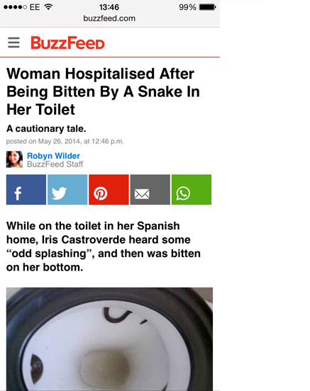
Buzzfeed-mobile-articleAlthough to be fair, at the far more important mobile article level, the presentation is cooler, with the colour focused on social sharing buttons.
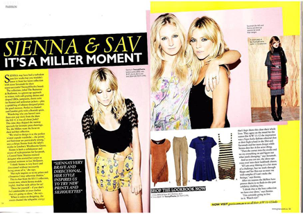
Grazia-magazineVox have taken a different tack. By making yellow the only colour, they’ve managed to retain it’s effectiveness, but without tarnishing it’s delivery. This is exactly what Grazia did in the magazine market. By using no colour other than yellow, the pallette looked like a fashion statement, and made the rest of the weekly market’s use of red obsolete overnight.

Vox--desktop-articleVox then go further by teaming yellow with grey, delivering a sense of sober authority. And in an unexpected twist, instead of black headlines, Vox use a very dark grey. When I first saw this in the ‘V’ of their twitter icon, I though it was an error, but this approach is consistently deployed in many places all through the site, particularly on mobile. The content can look pale and washed out, but it does prevent the words looking like sales messages.

Vox-mobile-HOMELinks are understated too, with a cool grey-blue, as opposed to Buzzfeed’s more eye-popping style.

Typographically, Vox has a cultured approach to their content. As any fule kno, there are only two fonts in the world, plain and fancy. Vox use both, with italic serif call-outs, traditional gothic headlines and modern sans text fonts. The feeling is sophisticated, although the small sizes create a somewhat pale reading experience.

Buzzfeed’s headlines and text are primarily in the highly legible and good-looking Proxima Nova. But with bits of Helvetica and other random fonts creeping in, there is a slight low-fi feeling and a lack of brand consistency.

Like Buzzfeed, Vox’s appeal is driven by virality of the headlines. Here’s a super-snarky story from Forbes, attempting to dismantle the thinking behind headlines such as ‘The Simpsons predicted the Ukraine crisis back in 1998’
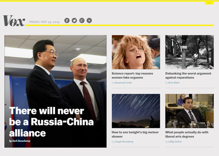
VOX-desktop-homepageBut Vox are also using content curation as a way of building a content mix, as this homepage shows. Here, they pair a super-dull Russia and China story (good for credibility) alongside an orgasm story (good for clicks). Overall, I sense the desire to have a slice of Vice’s now very substantial content marketing pie.
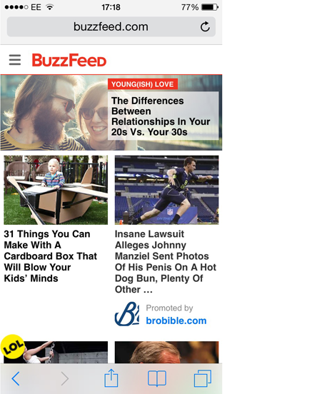
Buzzfeed-mobile-HOMEBy comparison, even on mobile Buzzfeed go flat out for volume. Everything’s turned up to eleven, all of it looks fun, but there’s not a serious item in sight. And in the American style, deploy the hyped up tone of capping up every word in a headline: ‘A Naked Woman Has Made The Alphabet Out Of Human Hair’

Vox use a more measured upper and lower-case European approach: ‘How conspiracy theories explain political parties’. This typographic technique has less urgency, but a lot more conversational intimacy. And would certainly be preferred by Buzzfeed’s UK editors.

Overall, the Vox design direction is somewhat dull. But it’s undeniably modern, with yellow keeping the site just inside the pop culture canon. From a business point of view, they have set out to claim the journalistic high ground, and go viral from there. Buzzfeed are attempting world domination the other way round, by taking the lowland masses first, and then attempting to scale the higher peaks.

vox-native-advertising

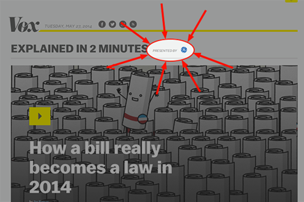
Like Buzzfeed, Vox’s business model is based on ‘native advertising’ or any other term used to describe ads that look like a bit like editorial. However, unlike Buzzfeed, it’s really hard to see which posts are ‘sponsored’, and which are not.

Political authority and influence may be the motivation behind the site, but aside from the click-bait headlines it’s hard to detect any real sense of tone in the content.

Unlike established news sites, I don’t yet know what Vox believe in, other than an enthusiasm for Obama Care. We may be conditioned to it, but when it comes to politics, readers need to know what the brand believes in order to work out the true colour behind the journalism.

This is a problem Buzzfeed just don’t have. What you see really is what you get. It’s not pretending to be cool, there’s no attempt to seduce with the presentation. Which makes me trust them all the more.

Brand or content, what should be seen first?

people-logosThe UK newspaper People closed their website a little while ago. Launched with the idea that it would be ‘Buzzfeed for grown ups’, pretty much everything went wrong, according to this excellent reporting from of all places, Buzzfeed. Patrick Smith reports that there was a lack of identity, a lack of focus, and a complete failure to grasp how the native advertising business model works.

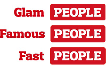
people-multiThis lack of brand benefit is perfectly expressed in the website logo. The way it worked (or rather, didn’t), was that the People logo was preceeded by a rotating series of words; ‘Sporty’, ‘Famous’, ‘Glam’, ‘Funny’ and so on. The story underneath didn’t change, but the context did.

What this did was remove any trace of brand from the content beneath. The stories became entirely generic, no tone, no point of view, no recall.

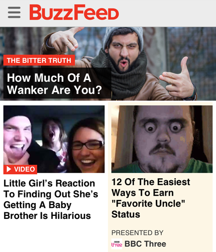
buzzfeedBy way of contrast, this is Buzzfeed’s home screen from the very same day. Which, when you compare the lead stories of ‘Bachelor’ and ‘Wanker’, pretty well sums up why Buzzfeed’s tone is so sharp.

Print has similar issues, but the context is very different. On a newsstand, when is right to put a coverline above the logo, and when should you never do it? Find out more after the jump.

See more

The colour of money: why does Hearst’s hot new launch look so bland?

dr-oz-the-good-lifeDr. Oz is a controversial figure. Billed as ‘America’s Most Trusted Doctor‘ he’s a top-notch heart surgeon, has a huge TV show and a massive social following. Oz has been named one of Esquires 75 Most Influential People of the 21st Century, as “the most important and most accomplished celebrity doctor in history.” But he often attracts establishment criticism, not just for advocating alternative therapies, but for his style. As a recent New Yorker profile explains, he employs words that serious scientists shun, like “startling,” “breakthrough,” “radical,” “revolutionary,” and “miracle.”

See more

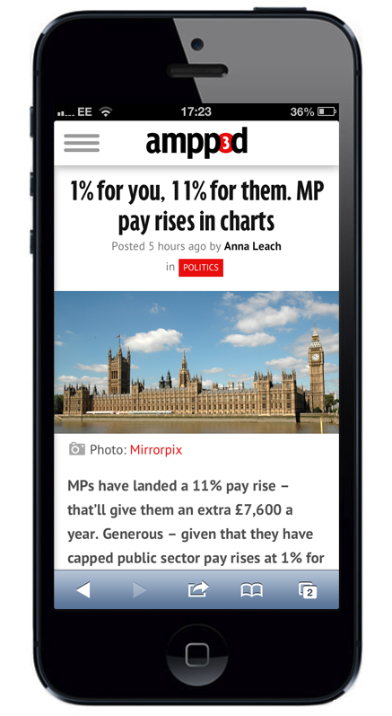
The best thing about The Daily Mirror’s new website ampp3d? It took just eight weeks to launch

The Daily Mirror have jumped onto the Buzzfeed bandwagon, with this new data journalism called ampp3d, here’s a story at gigaom that explains the approach:

‘The idea behind Ampp3d is to use social-sharing methods — snappy headlines, emotional content etc. — in the service of data journalism’

The speed of the development is impressive, just 8 weeks from decision to launch date. Also, the fact that Trinity Mirror are willing to experiment in this space, having already had a go with something called usvsth3m.com. Which whilst looks fun, hasn’t exactly set the world on fire.

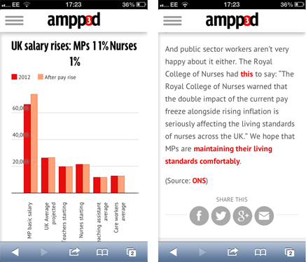
The Ampp3d site is pretty good. There are lots of smart stories, all well told with compelling visuals. The idea of simple data visualisation isn’t new, people from Business Insider to Furthr, have been doing this for ages. The thing that will determine Ampp3d‘s success, is whether users will want to share.

The visual cues are big, with social buttons front and centre at the bottom of the posts. So it’s now all down to whether the headline is engaging enough. There’s been a lot of debate about the new style of headline writing exploited by upworthy and in particular, viralnova. In short, this technique relies on doubling down on the emotion in the story, but stripping out the content. Here’s how Business Insider describes the method:

‘The headline model for the site is laughably smart. First, take a news story, add the phrase “you won’t believe” or “this ____ made me cry, but” and then the kicker sentence: “what happens next will blow your mind” or “then this happened.” There’s your recipe for viral success.’

The Ampp3d headlines are good, but if they can develop a real point of view that maintains a high level of emotion, they could do really well.

But what looks wrong here is the name. Ampp3d is hard to remember, impossible to type, and with a content and context that seems to talk more to the business model than any kind of user experience. The ‘3’ is totally confusing. Is this about the phone company, page three, or perhaps it’s just some hangover from the 3am girls. It may well be that in the digital space names mean diddly-squit, if the stuff is being shared, who cares what the site is called?

But I doubt it.

Update: Since I wrote this post, Martin Bellam, who launched the site has written a fine piece explaining how and why the name was chosen, along with many other insights into the challenges of getting a new launch out the door so fast. Recommended.

The Big Issue crowdsource their Christmas cover. Here’s why it really works…

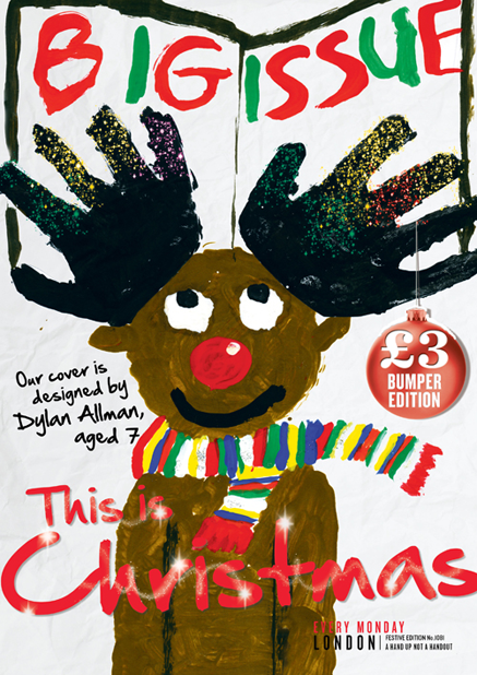
This is The Big Issue’s Christmas cover, designed by seven year old Dylan Allman, winner of their recent reader competition to create the cover. It’s the first time The Big Issue have ever done this, but I suspect it won’t be the last, as I think this is just great.

The principle is not dissimilar to that which schools get the kids to design Christmas Cards, in order to make parents want to buy them. it creates a sense of community, a feeling of innocence, and the belief that reindeer really are flying through the air.

This is all good, but the reason why this crowdsource cover is so clever, is that the hand prints deliver real human scale. Like the Hollywood pavement, where stars put their hands in the concrete, the work is intimate, immediate, and generates a real sense of connection.

I’m not sure about the script for ‘This is Christmas’, as it fights with the logo, but that’s not going to affect the sale, which I think should be pretty tasty.

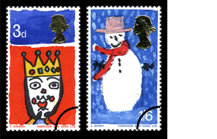
Update: My friend and colleague Mike Pretious has just commented, quite rightly pointing out that crowdsourcing childrens’ art is nothing new. As comments can’t take images, here’s his point: Britain’s Christmas stamps from 57 years ago!

Why The Independent redesign does not go far enough

This is the fifth redesign in as many years, which suggests Last Chance Saloon is not too far away. But here at coverthink we live in The Now, so let’s not worry about that, and just look at the work. The website has been redesigned alongside the paper, and there are interesting plans to introduce a new tablet app, but overall there appears to be no big change to the marketing of the brand. So I’m guessing the four redesign KPI’s are as follows:

1. Differentiate the paper against ‘i’, the Independent’s cheaper tabloid cousin.

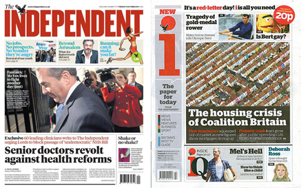
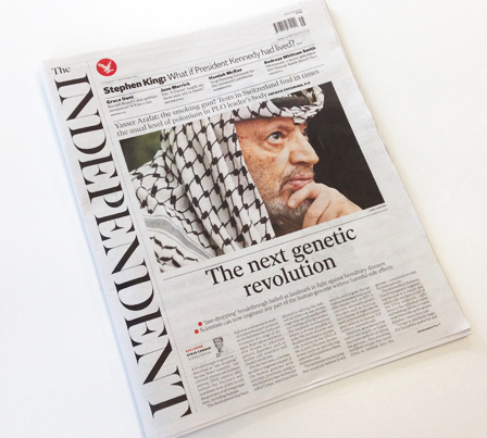
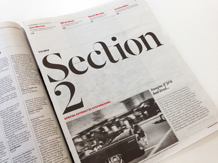
This picture shows the previous confusion between the two, with both carrying red in the masthead. The new design has undoubtably separated the two products, primarily through making the logo a black serif and putting it on its side. Magazine logos have been seen like this (The Face circa 1990) and I’m sure there will be European papers pulling this stroke too, but it’s not been seen on a British paper before.

Under normal circumstances, I hate type on it’s side. But in this instance I have real sympathy to the approach. Independent is a very long word, so this way the logo remains BIG and the remaining space is cut into a different sort of shape.

But with no logo at the top, the key is to put stuff in its place that genuinely expresses the brand essence. It can be content or marketing, but it has to really rock.

The top of the paper starts with a band of white space (including barcode and red eagle), signalling its ‘magaziney’ intentions. But this illumination means nothing if the content beneath doesn’t repay the investment.

On this cover the opportunity has been missed. The words are underwhelming, the type is small and there is no hierarchy within this critical part of the page. Which is frustrating, as some of the content is strong and highly ‘ownable’.

The second difficulty the new logo creates is how to divide the page. On a normal width, this can be done vertically, like the Daily Mail and Express; splash on the left, picture story on the right.

But with the new Indy, the narrow page means the picture story is presented over the splash. This profoundly diminishes the headlines’ importance, as well as suggesting the picture story is somehow part of it. All in all, it makes the paper feel more like a monthy review rather than a crusading, urgent and compulsive daily purchase.

2. Sell more ads.

This might work, as the paper looks more sophisticated. There’s a nice use of white space, elegant typography, and a sense of restraint all round. Regular advertising is going to stand out better. But as far as I can see, the increasing shift of clients money into content marketing has not been addressed.

3. Improve reader satisfaction

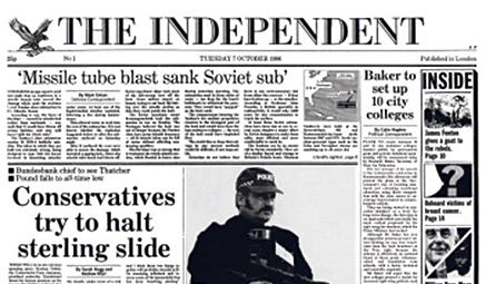
I loved the Independent when it launched in 1986, and so did many others. As the current editor Amol Rajan said this week, “It was radically different, politically neutral, with huge pictures and real gusto.” This is the top of the first issue, taken from the Indy’s own cover gallery. But in recent years it has struggled to maintain a clear editorial direction compared to the clarity of the Guardian, Telegraph and Times. Whether due to failure of editorial or creative direction is neither here nor there, a redesign is always an opportunity to have a fresh start.

The new look has been led by Matt Wiley, a well respected magazine designer, responsible for the upmarket men’s magazine Port, along with plenty of other good work.

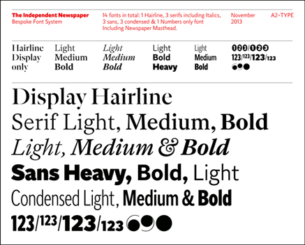
A full set of original fonts have been cut especially for the paper. They’re really good new typefaces, and give a great opportunity for the Indy to deliver content in its own voice. There’s an excellent overview in Creative Review, taking us through the design in fine detail, along with many images of the type in action.

But for all the beauty of the type, some of it is just too small to be easily legible. Readers have complained, obliging Amol Rajan to say that he has taken these comments on board and ‘asked the designers to address them urgently’.

Roy Greenslade, writing in the Guardian, applauds the team for the redesign, appreciating the “commitment to essay-writing as distinct from news busy-ness”. But he also points to the weakness of placing the editorial on page two, as well as other flatplan adjustments. Overall, he suggests readers will more baffled more than anything else.

For me, I have mixed feelings. I’ve bought the paper three times in three days, having not picked up a copy for years. I’ve read it, and I’ve enjoyed it.

But for all the boldness of the new logo, they just haven’t gone far enough. If the Independent’s owner, Evgeny Lebedev, can describe his paper as having “a proud record of innovation”, he should have put his money where his mouth is and done this:

a) Make the splash headline really tell the story. A few more words would deliver real newsstand cut-through, as well as allowing the line to be replicated and owned across all the digital platforms.

b) Properly visualise the splash. Use an infographic, a powerful picture or a typographic solution. Make the whole cover an image that people will want to share, to establish the idea of the front page as an event, as opposed to a template.

c) Put less copy in the paper, make the type bigger, and let stories run longer online. That way, browsing the paper will be a more pleasurable experience, as well as letting the print serve to market the digital platform.

d) Move the horizontal ad position off page three onto page two. As it stands, the paper comes to a grinding halt before it’s even begun.

4. Stabilise newsstand circulation

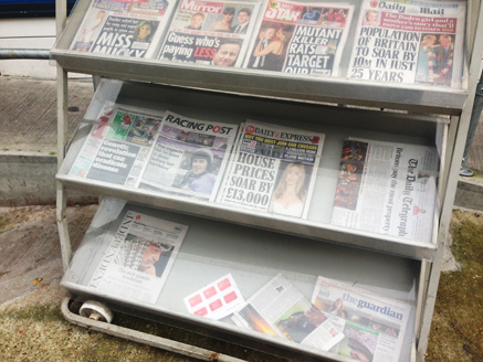
As always, this is the only KPI editors and owners really care about. Here’s the petrol station in Hackney where I bought my issue last Thursday. Given the current landscape, you’d be a brave man to think that a redesign alone will shift more copies. The fact of the matter, is that paid-for media brands now have to work incredibly hard to stimulate demand. This requires great content, a powerful brand filter and a sophisticated marketing operation. Daily newspapers must set the agenda, and get talked about across every platform.

There’s an interview with Editor Amol Rajan in Media Week, where he talks a good talk about his hopes for the redesign. Media week says: “By recalling the spirit of its founders, Rajan hopes to reinforce the paper’s Enlightenment values and strike a chord in what he considers to be an increasingly ‘sceptical but engaged’ age”

But the line that caught my eye was: “There are maybe a dozen areas we can do absolutely better than everybody else”.

Like all the other serious broadsheets, The Independent covers just about everything. so communicating this brand’s point of difference is absolutely essential in letting the reader know why they are buying it. The primary task of a redesign like this is to focus the readers attention on the things that really matter, but for me this is where it falls down. The design is too polite, and the editorial direction not ruthless enough.

Add that to the lack of newsstand cut through, and I can’t see this redesign making any significant difference to copy sales any time soon. I really hope I’m wrong.

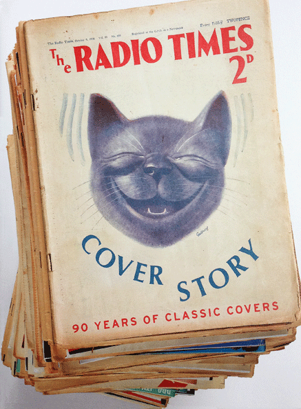
Surprising, delightful, emotional: Radio Times publishes it’s own book of classic covers

There aren’t many magazine brands that can publish a hardback book of their covers alone. Rolling Stone, Esquire and Vogue have done it, now the Radio Times joins this elite club.

Arguably the biggest magazine in the UK, Radio Times has occupied two very different positions in the publishing landscape. Firstly as a monopoly publication of the BBC, and then as a regular commercial offering, competing with all the other listings titles. Radio Times is currently celebrating its 90th anniversary, this book show what an incredible role the title has played in documenting British cultural life,

Unlike the titles mentioned earlier, Radio Times is a weekly, so it’s not possible to put every cover in the book. Skillfully curated by their longstanding Art Director and Deputy Editor, Shem Law, the book has all the famous ones, together with a whole load more that surprise, delight, and frankly make you feel just a little bit emotional.

It’s not available in the shops, but you can buy it online in the Radio Times shop. At only twenty-odd quid, it’s got ‘Christmas present’ written pretty much all over it!

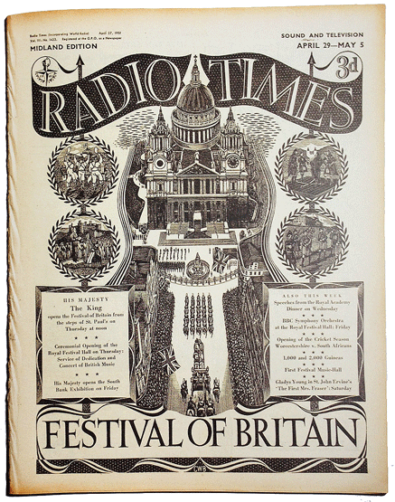
There are way too many amazing covers to show on my blog, so here is just a tiny selection. This cover is from 1951, with what appears to be a one-off logo specially for the Festival.

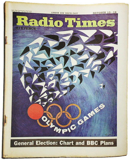
For the 1964 Winter Olympics, an Escher inspired illustration from Victor Reinganum. A groovy new sixties logo too.

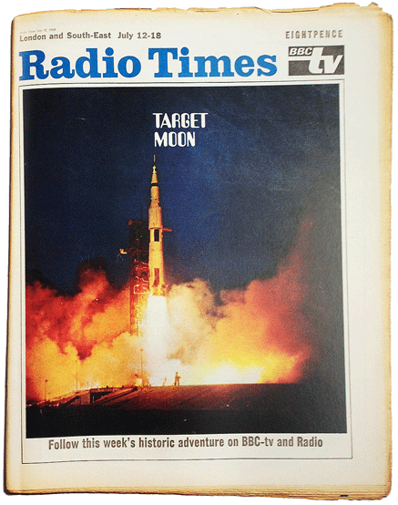
Another from the sixties, this time the moon landings in 1969.

Six months later, Morcambe and Wise usher in the 70’s, with this New Year issue. A measure of the power of this image is that not only can we not see their faces, but Radio Times are confident enough to leave their names off too, referring to them only as ‘The lads’. This cover also presents the logo that for many people, is still the Original & Best.

An indication of the level of effort put into all these covers, is this amazing cover from 1977. Not an illustration, it’s a real tapestry, made by Candace Bahouth and commissioned by then art editor David Driver.

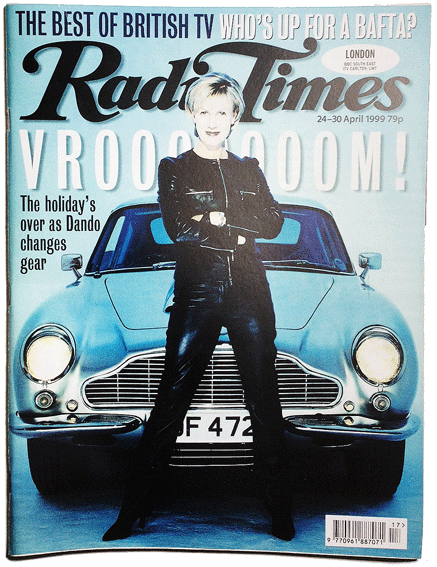
The nineties saw the listings market become de-regulated, which meant Radio Times now faced real competition on the newsstand, notably from TV Times. The logo has been given a whole load of extra muscle, and celebrity covers are now the order of the day. This is Sue Dando from 1999.

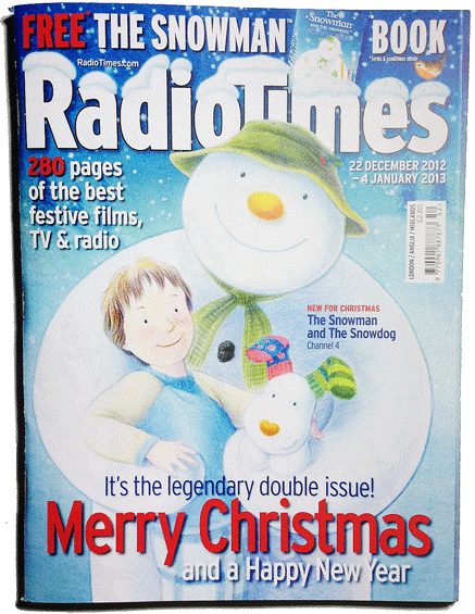
The new millenium saw the logo change again, this time to the current position as shown by last years excellent Christmas cover.

In the digital age it seems impossible that anyone could ever want to buy a paper listings magazine, but buy they do, by the million.

Between 2004 and 2013 I’ve  had extensive and continuous involvement in all of IPC’s TV listings portfolio: TV Times, What’s On TV, TV Easy and TV & Satellite Week.

My view as to why these things still work is that compared to digital alternatives not only is the habit more deeply ingrained, but importantly, the listings are just easier and simpler to use than an epg.

And crucially, the sociability is more universal. By that, I mean the whole family, from Granny down to the kids, can easily use and pass round a printed magazine.

In short, they connect the reader to a shared experience of being At Home.

For those interested in a deeper enquiry to covers in the listings market, take a look at my earlier post on coverthink. Here, I look at the differences between Radio Times and TV Times, specifically the challenges of using six images on a cover as opposed to just one.

Time magazine makes Church & State finally collapse!

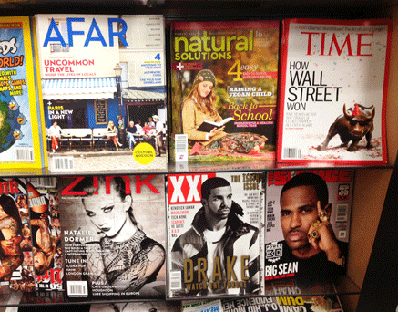
Here’s a great cover of Time, fresh out this week. I don’t know if the bull really does have such a drunken smile, whether it’s a model or all done in post. But either way it’s bright, fast and funny.

I like the white ground too, it makes the red border pop, much like their infamous breastfeeding cover we all wrote about not so long ago.

Time’s not exactly a newsstand powerhouse, but it still looks good in the rack.

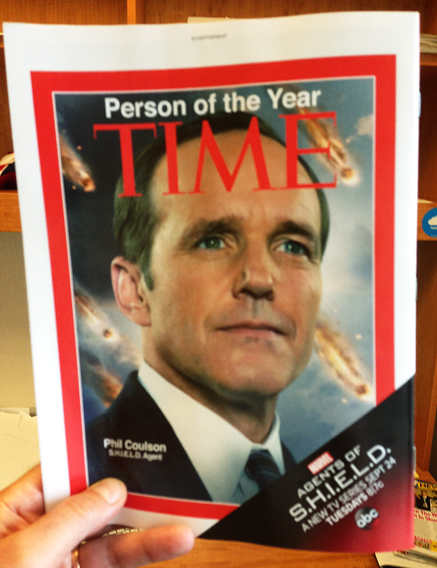
But check this out, the BACK cover! Given how queasy Americans can be about issues of Church and State, I was surprised to see this, but I think it works really well.

It’s a great ad, but there’s no way any reader could mistake it for editorial, because it’s the bleeding of the red border that makes a Time cover just that. Here, the white frame around the red makes clear that this is not the Real Thing.

But bleed is an effect only found in print. It’s a powerful gesture, as it suggests the colour (or the image) goes on forever, that it’s merely the limitation of the production process that has determined where the edge is. This is one of the reasons that reportage images work much better when bled.

But what happens in digital? There’s no limit to the canvas there, so there’s no physical indication to the edge of the picture. Which suggests that online, that S.H.I.E.L.D. ad is going to look an awful lot more authentic.

Five must-see, must-read links

Genius. Print your twitter feed onto toilet rolls. It’s called #shitter, apparently.

Great post from Neil Perkin’s fine blog, on why big companies don’t innovate more.

Fair comment from Fast Company on Yahoo’s new logo. Given the minefield, I think it’s good work.

This kiosk prints magazines as they’re purchased. Neat!

Will magazine brands get ecommerce right?

An Englishman In New York

Well, sort of…

If you haven’t already guessed, this is my favourite magazine. Which seems more than appropriate since I’m currently consulting in New York City. You’ll find a shorter version of this post in the new book My Favo(u)rite Magazine, along with 88 other fantastic titles. It’s a brilliant project for a truly worthy cause, if you haven’t already done so, you can order yours at magculture right now.

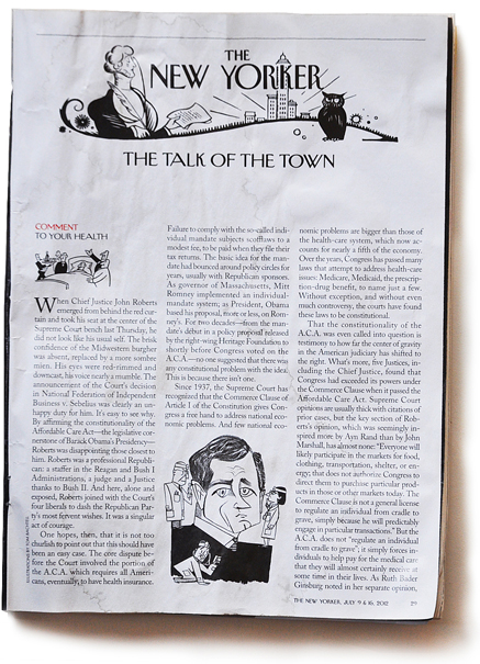
The New Yorker

I lived in New York City for three years from 2001, taking up a position on Condé Nast’s Mademoiselle, and Rolling Stone after that. When asked what I thought of The New Yorker, I replied: ‘Not much’, brought up as I was on a diet of Smash Hits, The Face and European news weeklies. What business did I have with pages of uninterrupted text and tales of some place called ‘The Upper East Side’

9/11 changed all that. Not only did I become a New Yorker in that moment, but suddenly I had an appetite for news about America’s place in the world I could really trust. And for me, trust is still the strongest editorial currency; a value The New Yorker has held for an awfully long time.

With the most polyglot population imaginable, New York is truly a world city. Along with the movies, TV shows and general mythology, I believe everyone carries a little bit of the city with them. Should we wish, we can all be spiritual New Yorkers even if we have never lived there.

I could have chosen many issues as my favourite, but in the end I plumped for one I was reading when writing this post. From July 9th 2012, it’s not exactly the current issue, but I only finished reading it in the bath last week.

One reason why print still works so well, is the visibility and sheer physicality of the navigation. You always know exactly where you are, both on the page and in the book. The New Yorker amplifies this benefit by setting the type perfectly, using a minimum of page furniture and appearing to never change.

This means the reader experience can become highly ritualised. Flip though the cartoons, read the reviews, zip through Talk of The Town, and only then dive into a feature.

In my July 9th issue, I’d pulled out pages 48 to 68 in order to keep the floor clean as I clippered my hair. But mercifully, the big TED talks feature ‘Listen And Learn’ had remained intact. I wasn’t planning to read ten thousand words on something I wasn’t exactly searching for, but such is my trust in the brand, I made a start.

And what a piece of journalism it is. Immaculately researched and full of insight, the story had such power that it ever-so-slightly adjusted my world view, in a way that I believe will be permanent. Which is surely the greatest thing any media brand can ever do.

Finally, the cover; a celebration of Barack Obama’s health reforms. And like all New Yorker covers, it works on many levels. As an illustration, it requires the viewer to exercise their imagination. But then, this opening of our minds then allows the masthead to really work its genius. Because with no other coverlines, the masthead becomes the caption. In this moment, Barack Obama clearly has become a New Yorker.

But more than that, (and at the risk of appearing in Pseuds Corner), if we are all spiritual New Yorkers, looking at any New Yorker cover means that in some small way, we end up looking at a reflection of ourselves.