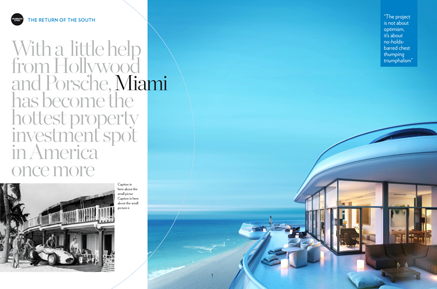
Welcome, fellow punters, to the annual PPA Front Cover Of The Year Chase, decided as always by public vote. You can cast yours here, but to guide you in your deliberations here is Honest Andy’s annual guide to this year’s big British race-off. . .
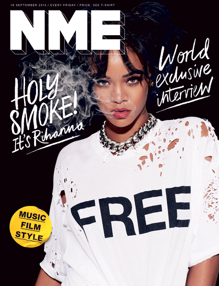 NME (4-5 Favourite)
Rihanna looks by far the toughest filly in the field, and given her legions of adoring fans she must be a clear favourite to take this year’s trophy. Last year’s doping allegations are still swirling around, however, and there is concern that the stable lad seems to have turned out this most beautiful of creatures still wearing her rug. Odds-on though to bring it home on June 30.
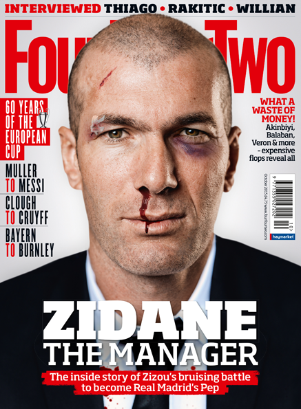 FourFourTwo (2-1)
The legendary French stallion Zidane was for a while unbeatable at any distance until a stewards’ enquiry over a very public head-butting incident ended his brilliant career. Now he’s back, and with this sort of strong eye contact is expected to do very well.
 Stylist (4-1)
The most consistent stable in the field, producing winners week-in week-out. Comfort Food’s class is undoubted but may be just not quite energetic enough to succeed in this particularly tough race. Very nice touch though with those lovely knitted silks.
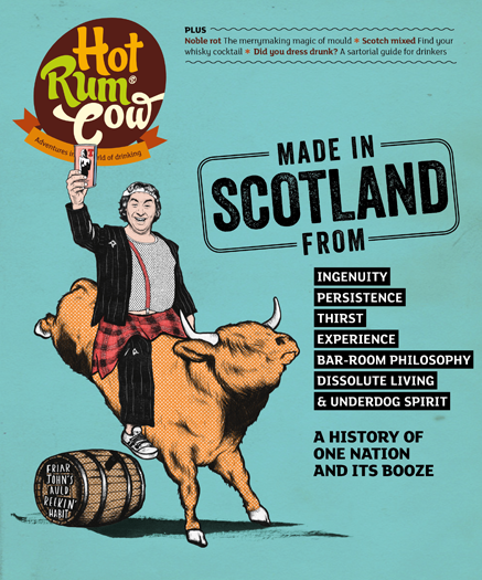 Hot Rum Cow (5-1)
Ladies Day this is not. Somehow Rab C. Nesbitt seems to have muscled up to the starting line riding a Highland cow and clutching a pint of Tennents. This contravenes every rule in the jockey club book, but then, that’s the joy of working out of a smaller yard such as White Light Media. I fully expect this Scottish insurgent to take out Heat at the first bend, but whether it has the legs to last the distance remains to be seen.
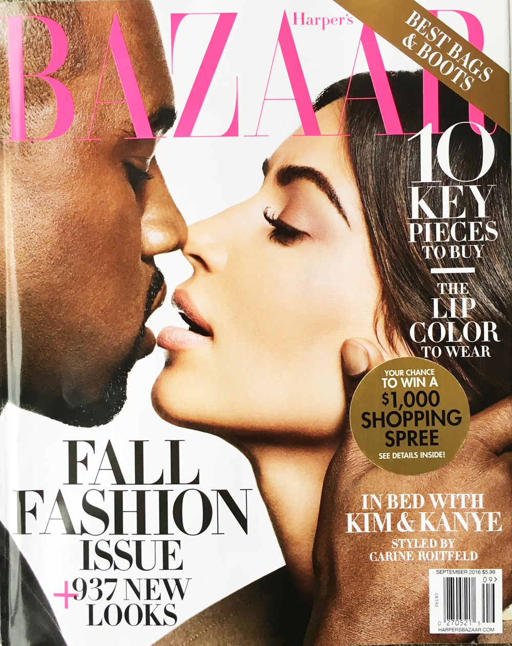
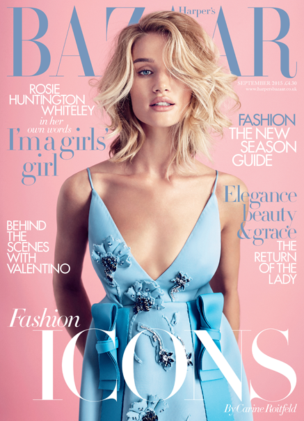 Harper’s Bazaar (8-1)
Easily the best turned out, and with the nicest of silks. Exquisite breeding and carrying the lightest weight, Harper’s is certainly the purists’ pick here. This is no ordinary race though, the ground is soft, the going is tough, and I simply cannot see such a fine serif being able to stand up to some of the rougher boys here. I’m saying tears before bedtime for this one.
 The Economist (12-1)
This international stable tend to favour three-day eventing, where they can make their sophisticated business model and specialist appeal pay real dividends. This is the first time they’ve made the cut for a race such as this, so frankly, it’s a hard one to price. All that said, Honest Andy reckons this could be a good value each-way bet.
 Kent Life (50-1)
An extraordinary bloodline stretching back 800 years makes this cover well worth its place in such a field. Training techniques have changed so much over the last few centuries however, that I’m not sure such an old warhorse will have the pace in the final furlong. That said, I can see it causing plenty of trouble with Country Life at the start.
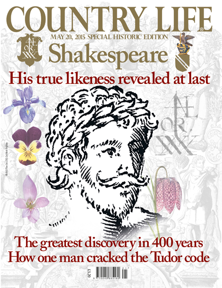 Country Life (50-1)
Another storied bloodline, but with the advantage of having legendary jockey Will Shakespeare aboard. Tricky silks though, which will make it hard to track such a pastel affair on your TV. Personally, I much prefer Will’s last outing in the excellent National Portrait Gallery, where he decimated a very strong field over a similar distance.
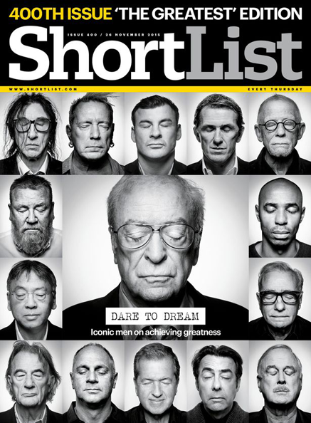 Shortlist (50-1)
Excellent bloodlines again here, but this one looks so sleepy there’s a real risk the public will simply overlook it. I suggest the stable slip something in its feed, and fast.
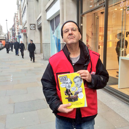
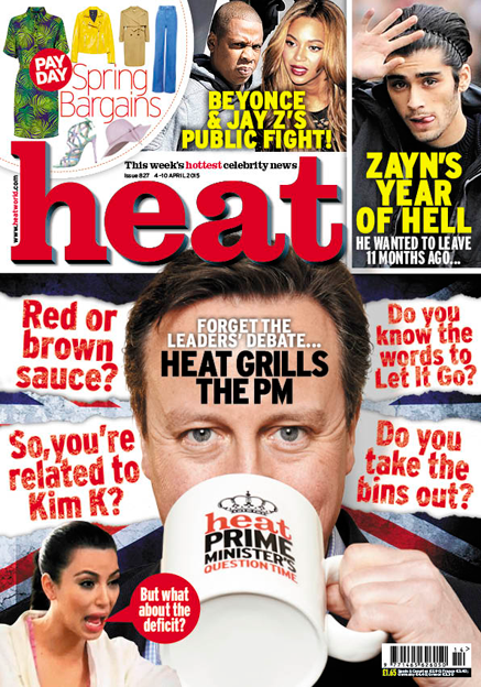 Heat (100-1)
Getting Dave Cameron up top seemed like a good idea back in the day when he was winning every single race, but things have changed of late. Dave was a faller at Newbury, threw a shoe at Towcester and looks like he could be unseated at Westminster. If it can get past Hot Rum Cow it might show early but I expect it to fade before the last. And Heat should really change their silks, all that red and yellow is making my eyes go all funny and now I need to lie down for a bit.
Remember, cast your votes here and see you all for the weigh-in on June 30!